Fusedash FAQs
Fusedash is an AI data visualization platform for teams to build dashboards, charts, and reports from CSVs and APIs, with maps, storytelling, and data chat.

FAQs of Fusedash
What is Fusedash?
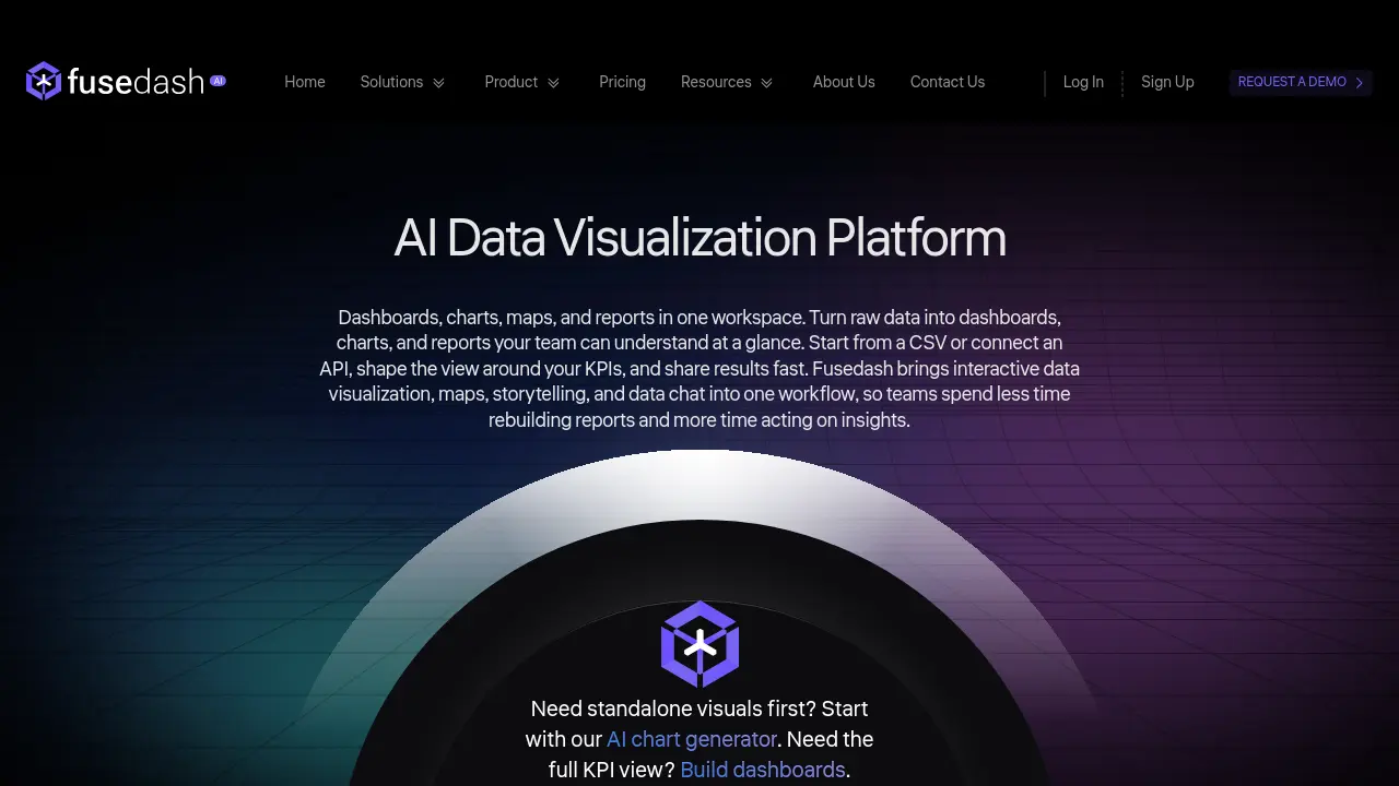
Fusedash is an AI data visualization platform that combines dashboards, charts, maps, storytelling reports, and data chat into a unified workspace. It allows users to convert raw data from sources like CSV files or APIs into interactive visuals, facilitating faster insight discovery and decision-making across teams.
What are the primary features of Fusedash?
Fusedash offers AI chart generation for automated visuals, flexible dashboard views adaptable to different audiences, data integration from CSV, APIs, and databases, AI chat for natural language queries, and real-time monitoring interfaces. These features support reusable datasets and consistent reporting without redundant rebuilds.
How does Fusedash handle data integrations and source connectivity?
Fusedash connects to external data via CSV uploads, API integrations, or database links. Users can merge multiple datasets and enhance them with public data for contextual insights. All connected data remains organized and reusable across charts, dashboards, and reports within the platform.
Who are the typical users of Fusedash?
Fusedash serves business leaders, analysts, finance teams, marketing teams, and operations professionals in sectors like e-commerce, financial services, SaaS, agencies, and logistics. It addresses needs for KPI tracking, executive reporting, client dashboards, and operational monitoring through customizable visualizations.
What pricing options and support resources does Fusedash provide?
Fusedash offers tiered pricing plans accessible on the /pricing page, including options for free trials and demo requests. Support is available through the Contact Us page at /contact, complemented by online documentation, blog resources, and community forums for self-guided assistance and troubleshooting.
How to use Fusedash
- Fusedash is an AI data visualization platform that transforms raw data from CSVs or APIs into interactive dashboards, charts, maps, and narrative reports for collaborative insight generation.
- Connect your data source by uploading a CSV file or integrating an API/database, then configure refresh schedules to maintain dataset currency within the workspace.
- Define standardized KPIs and dimensions to ensure consistent metric definitions and reliable time comparisons across all visualizations and team reports.
- Create audience-specific views by selecting dashboard, chart, map, or storytelling formats, customizing layouts, filters, and interactive elements without data duplication.
- Use the AI chart generator to automatically produce appropriate visuals from your dataset, refine labels and comparisons, and reuse charts across multiple dashboards.
- Interact with the AI chat feature to pose plain-language data questions, receive suggested metrics or anomaly highlights, and convert responses into shareable views.
- Incorporate storytelling sections into dashboards to add contextual narratives that explain performance changes, implications, and recommended actions for stakeholders.
- Share interactive dashboards with controlled access, enable real-time monitoring for live data streams, and apply the visualized insights to guide strategic decisions.